GUI Components
Gui는 GuiComponent로 어떻게 표시할 지 사용자가 직접 조합할 수 있습니다.
KakaoMapsSDK에서는 아래 종류의 Component를 제공합니다.
| Type | Description |
|---|---|
| GuiText | 글씨를 나타내기 위한 component |
| GuiLayout | child component를 가질 수 있는 component |
| GuiImage | image를 나타내는 component. child component를 가질 수 있습니다. |
| GuiButton | 클릭 이벤트를 받을 수 있는 component. child component를 가질 수 있습니다. |
| GuiAnimatedImage | Gif처럼 animation되는 image component. child component를 가질 수 있습니다. |
Component Property
위 모든 종류의 GuiComponent는 공통적으로 아래와 같은 Property를 가집니다.
- componentId : Gui내에서 component를 식별하는 id입니다. child component를 가져올 때 이 ID값으로 child component를 얻어올 수 있습니다.
- padding : 컴포넌트 기준으로 상하좌우의 여백값을 의미합니다. padding이 0인 경우, 컴포넌트가 차지하는 크기는 컴포넌트 자체의 사이즈가 됩니다. padding값을 줄 경우 컴포넌트 크기 + 상하좌우 여백값이 컴포넌트의 크기가 됩니다.
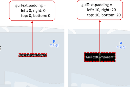
위 그림에서 왼쪽 그림은 패딩값을 설정하지 않았을때의 상태입니다. GuiTextComponent에 Padding값을 주지 않았기 때문에 Component의 최종 크기는 GuiTextComponent자체의 크기로 결정됩니다. 반면 오른쪽 그림은 GuiText에 상하좌우로(20,20,10,10)씩 Padding을 주게 되면, GuiText 컴포넌트의 크기는 text자체의 크기와 padding을 합친 값이 컴포넌트의 최종 크기가 됩니다.
-
origin : 컴포넌트의 원점을 설정합니다. Gui는 기본적으로 parent-child 관계로 이루어지기 때문에 root component가 존재하는데, 이 property는 root component에만 유효합니다. 즉, root component에 설정된 원점을 기준으로 component내에서 좌표 체계가 구성됩니다.
-
align : 컴포넌트가 차지하는 최종 공간에서의 정렬 위치를 의미합니다. GuiLayout안에 child component로 구성할 때, Layout의 최종 크기는 컴포넌트의 최종 크기들을 모두 합친 크기가 됩니다. 이 때 Layout 배치에 따라 여분의 공간이 있는 component는 배치 방향을 지정할 수 있습니다.

위 그림의 경우 InfoWindow의 body layout이 GuiButton과 GuiText로 이루어져 있습니다. 이 때 GuiButton의 크기때문에 GuiText는 본래 컴포넌트 사이즈보다 큰 공간을 갖게 되며, 오른쪽 그림의 회색으로 표시한 부분만큼의 여유분이 생깁니다. 이 때 GuiText의 정렬 방향을 설정할 수 있습니다.
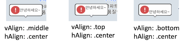
GuiText Component에 주어진 여유분의 공간에서 align을 설정하면 위와 같이 배치 위치를 지정할 수 있습니다.
- type : 컴포넌트 자체의 타입을 의미합니다. 컴포넌트 타입은 child component를 가질수 있는 컴포넌트와 가질 수 없는 컴포넌트가 있습니다.
GuiText
Gui에 글자를 그리기 위해 GuiText 컴포넌트를 사용합니다. 여러 라인으로 추가가 가능하며, 각 라인별로 텍스트 스타일을 지정할 수 있습니다.
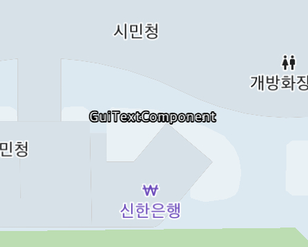
아래 예제는 SpriteGui에 GuiText를 넣어서 text gui를 표시하는 예제입니다.
    func createSpriteGUI() {
        let mapView = mapController?.getView("mapview") as! KakaoMap
        let guiManager = mapView.getGuiManager()
        //SpriteGui를 생성. SpriteGui는 화면좌표상의 특정지점에 고정되는 GUI이다.
        let spriteGui = SpriteGui("testSprite")

         //화면의 우하단으로 배치
        spriteGui.origin = GuiAlignment(vAlign: .middle, hAlign: .center)

        //GuiTextComponent 생성. 텍스트 내용과 텍스트 스타일을 지정한다.
        let text = GuiText("testText")
        text.addText(text: "GuiTextComponent", style: TextStyle(fontSize: 20, fontColor: UIColor.white, strokeThickness: 2, strokeColor: UIColor.black))

        //sprtieGui의 childComponent로 GuiText 컴포넌트를 추가한다.
        spriteGui.addChild(text)

        let _ = guiManager.addGui(spriteGui)
        spriteGui.delegate = self
        spriteGui.show()
    }
위 예제의 경우, 아래와 같이 표시됩니다.
GuiLayout
GuiLayout은 여러개의 child component를 가질 수 있는 컴포넌트입니다. 여러개의 child를 추가하면서 child의 배치방향을 정할 수 있으며, 배치는 child를 추가한 순서대로 구성됩니다. GuiLayout의 Property는 아래와 같습니다.
| Property | Description |
|---|---|
| arrangement | child component의 배치 방향. vertical / horizontal로 설정 가능 |
| showSplitLine | child component 구분선 표시 여부 |
| splitLineWidth | child component 구분선 두께 |
| splitLineColor | child component 구분선 색깔 |
| bgColor | Layout의 배경 색깔 |
| children | GuiLayout이 가지고 있는 children component |
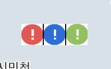
아래 예제는 SpriteGui의 기본 layout에 여러개의 image를 넣는 예제입니다.
    func createSpriteGUI() {
        let mapView = mapController?.getView("mapview") as! KakaoMap
        let guiManager = mapView.getGuiManager()
        let spriteGui = SpriteGui("testSprite") //SpriteGui를 만듬.

        spriteGui.origin = GuiAlignment(vAlign: .middle, hAlign: .center)
        spriteGui.showSplitLine = true // layout내의 컴포넌트 구분선을 추가한다.
        spriteGui.arrangement = .horizontal // layout내의 컴포넌트 배치 방향을 수평으로 설정. 컴포넌트가 수평 방향으로 차례대로 쌓인다.
        spriteGui.bgColor = UIColor.white // layout의 배경 컬러값을 white로 설정.

        // 첫번째 이미지 컴포넌트
        let image1 = GuiImage("image1")
        image1.image = UIImage(named: "noti.png")

        // 두번째 이미지 컴포넌트
        let image2 = GuiImage("image2")
        image2.image = UIImage(named: "noti2.png")

        // 세번째 이미지 컴포넌트
        let image3 = GuiImage("image3")
        image3.image = UIImage(named: "noti3.png")

        spriteGui.addChild(image1)
        spriteGui.addChild(image2)
        spriteGui.addChild(image3)

        let _ = guiManager.addGui(spriteGui)
        spriteGui.delegate = self
        spriteGui.show()
    }
위 예제의 경우 아래와 같이 표시됩니다.
GuiImage
GuiImage는 이미지를 표시하는 컴포넌트입니다. 이미지의 크기가 따로 지정되지 않으면 원본 사이즈대로 그려집니다. 단, 배경이미지로 사용하는 경우 9-patch형태로 리사이징되어서 컴포넌트 사이즈가 이미지 사이즈 크기가 됩니다. GuiImage는 한개의 child component를 가질 수 있습니다. GuiImage의 Property는 아래와 같습니다.
| Property | Description |
|---|---|
| image | 사용할 이미지를 지정합니다. |
| imageSize | 이미지 사이즈를 지정합니다. 별도로 지정하지 않는 경우 Image의 사이즈로 그려집니다. |
| imageStretch | 이 값을 지정하면 리사이징 될 때 9-patch형태로 그려집니다. |
| child | 하나의 child component |
아래 예제는 SpriteGui에 GuiImage를 넣어서 9-patch형태로 리사이징을 해서 child component를 설정하는 예제입니다.
func createSpriteGUI() {
let mapView = mapController?.getView("mapview") as! KakaoMap
let guiManager = mapView.getGuiManager()
let spriteGui = SpriteGui("testSprite") //SpriteGui를 만듬.
spriteGui.origin = GuiAlignment(vAlign: .middle, hAlign: .center)
// 9-patch 형태로 사용할 GuiImage Component 생성
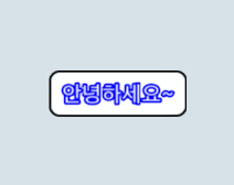
let bgImage = GuiImage("bgImage")
bgImage.image = UIImage(named: "white_black_round10.png")
bgImage.imageStretch = GuiEdgeInsets(top: 9, left: 9, bottom: 9, right: 9)
// GuiImage의 child로 설정할 GuiText Component 생성
let text = GuiText("text")
text.addText(text: "안녕하세요~", style: TextStyle(fontSize: 20, fontColor: UIColor.white, strokeThickness: 2, strokeColor: UIColor.blue))
// GuiText를 GuiImage의 child component로 설정한다.
bgImage.child = text
// SpriteGui에 GuiImage 컴포넌트 추가.
spriteGui.addChild(bgImage)
let _ = guiManager.addGui(spriteGui)
spriteGui.delegate = self
spriteGui.show()
}
위 예제의 경우 아래와 같이 표시됩니다.
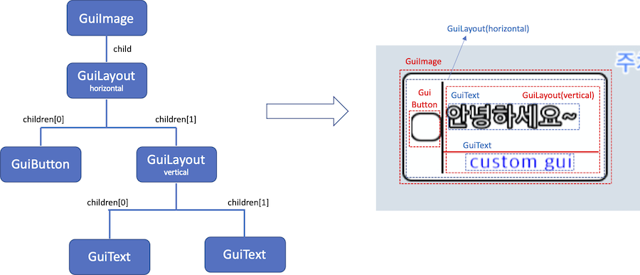
GuiImage에 child component를 GuiText 컴포넌트 뿐만 아니라 GuiLayout으로 설정해서 여러개의 컴포넌트를 자유롭게 구성할 수 있습니다. 즉, child component를 활용해서 아래와 같은 복잡한 구성도 가능합니다.
GuiButton
GuiButton은 클릭 이벤트를 받을 수 있는 GuiImage의 한 종류입니다. GuiImage의 한 종류로, child component를 설정할 수 있습니다. 즉, click event를 받을 수 있는 image입니다. GuiButton을 구성하는 Property는 아래와 같습니다.
| Property | Description |
|---|---|
| image | 사용할 이미지를 지정합니다. |
| imageSize | 이미지 사이즈를 지정합니다. 별도로 지정하지 않는 경우 Image의 사이즈로 그려집니다. |
| imageStretch | 이 값을 지정하면 리사이징 될 때 9-patch형태로 그려집니다. |
| child | 하나의 child component |
| pressedImage | 버튼 클릭 상태에서 표시하는 이미지 |
| pressedImageSize | pressedImage 사이즈. 지정하지 않으면 원본 사이즈로 그려집니다 |
GuiButton이 클릭되면, GuiEventDelegate의 guiDidTapped Event를 발생시킵니다. 아래 예제 코드는 gui 클릭 이벤트를 구현하는 예제입니다.
    func createSpriteGUI() {
        let mapView = mapController?.getView("mapview") as! KakaoMap
        let guiManager = mapView.getGuiManager()
        let spriteGui = SpriteGui("testSprite") //SpriteGui를 만듬.

        spriteGui.arrangement = .horizontal
        spriteGui.bgColor = UIColor.clear
        spriteGui.splitLineColor = UIColor.white
        spriteGui.origin = GuiAlignment(vAlign: .bottom, hAlign: .right) //화면의 우하단으로 배치

         // 버튼 두개 생성
        let button1 = GuiButton("button1")
        button1.image = UIImage(named: "track_location_btn.png")

        let button2 = GuiButton("button2")
        button2.image = UIImage(named: "tile.png")

        spriteGui.addChild(button1)
        spriteGui.addChild(button2)

        let _ = guiManager.addGui(spriteGui)
         // gui event의 delegate를 지정한다.
        spriteGui.delegate = self
        spriteGui.show()
    }

    // GuiButton이 클릭되면 아래 delegate를 호출한다.
    func guiDidTapped(_ gui: KakaoMapsSDK.GuiBase, componentName: String) {
       // 클릭된 gui 객체와 클릭된 컴포넌트의 name을 이벤트로 전달한다.
        print("Gui: \(gui.name), Component: \(componentName) tapped")
        if componentName == "button1" {
            //do something
        }

        if componentName == "button2" {
            //do something
        }
    }
GuiAnimatedImage
GuiAnimatedImage는 GuiImage처럼 이미지를 받지만, 여러장의 이미지로 구성하여 Gif처럼 움직이는 이미지를 표시할 수 있습니다. GuiAnimatedImage는 하나의 child component를 가질 수 있습니다. GuiAnimatedImage를 구성하는 Property는 아래와 같습니다.
| Property | Description |
|---|---|
| images | 사용할 이미지 배열 |
| imageSize | 이미지 사이즈를 지정합니다. 별도로 지정하지 않는 경우 Image의 사이즈로 그려집니다. |
| duration | 애니메이션 1회 재생 시간을 지정합니다. |
| playCount | 애니메이션 반복 횟수를 지정합니다. |
| child | GuiAnimatedImage의 child component |